Creating a CV Page with json-resume
Posted on October 25, 2023 • 13 minutes • 2578 words • Other languages: <a href="https://amcloudsolutions.de/de/blog/cv-article/" lang="de">Deutsch</a>
Table of contents
Welcome to the next part of the series on how I created my website. This post continues after the project setup and title page design in the last article . It will show you how I used json-resume to create a custom resume page styled in my theme. You can get the full code for the site from my public repository .
Prerequesite
To start with this post, you will need a running version of a HUGO website with any theme active. If you want to follow the instructions step by step, you’ll need a project using the blist-theme and the customizations I made in my last post .
Introduction
The blist-theme is perfect for a blog, but a resume needs a totally different layout than a blog article. That’s why I decided to implement a custom template for the resume, that still uses a design related to the theme. Although, you can use variations of the following instructions, with any other HUGO theme to create your resume page, this article is based on the blist-theme and some classes or styles may not be available with your theme.
Let’s move on to the topic of creating our resume. Fortunately, I’ve found thegruvbox Theme as an inspiration. In this article I’ll show you, how to combine the essential parts of the gruvbox theme with our website to create a homepage, that extends the blog format with a CV for personal presentation.
Adding json-resume to the project
We don’t want to change the whole theme just to create our resume so what we are going to do is analyze the gruvbox theme and find out, how we can integrate a resume into our own design. The gruvbox repository uses the hugo-mod-json-resume HUGO module to display the CV. json-resume is an open source format to unfiy CV data as a JSON-Object. The hugo-mod-json-resume module uses this format to generate an html layout for HUGO websites out of this data format. This means, that all we need from the gruvbox theme, is the hugo-mod-json-resume plugin.
The HUGO cli provides us with functions to manage such plugins. At first you have to initialize a HUGO module in your root directory. Typically you will name your module with your domain or a subpath of your domain.
hugo mod init amcloudsolutions.de
Then install the hugo-mod-json-resume by adding the following to the hugo.toml File in your project.
[module]
  [[module.imports]]
    path = "github.com/schnerring/hugo-mod-json-resume"
  [[module.mounts]]
    source = "node_modules/simple-icons/icons"
    target = "assets/simple-icons"
and run the commands to download the module and install npm packages
hugo mod get
hugo mod npm pack
npm install
Additionally, we will copy the default stylesheet from the hugo-mod-json-resume repository
to our static/ directory. Later we’ll use this stylesheet to customize the json-resume templates. Now create a directory data/json_resume and add example data files
with your resume information. Name them en.json and de.json for the different languages. That completes the setup of json-resume, let’s take a look at how to create a page with the plugin.
Adding a CV page
There is no menu item for a CV page in the currently configured routes, to change this go to your hugo.toml and add the routes for all your supported languages.
    [[languages.en.menu.main]]
        name = "CV"
        url = "cv"
        weight = 2

    [[languages.de.menu.main]]
        name = "Lebenslauf"
        url = "cv"
        weight = 2
The weight property defines the position of the menu items from left to right (top to bottom on small screens), make sure you adjust the values of the other menu items according to your desired position of the CV item. Now we’ll create a file cv.md for each language in content/<language>/. Now we’ll create a cv.md file for each language in content/<language>/. Note that the url you’ve set in hugo.toml must match the name of the file. I’ve decided to use the same urls for the English and German versions, so the user can switch between languages while staying on the cv page. Fill the cv.md files with the content of my example-cv file
. It can’t be displayed here, because HUGO would start to render the markdown content. Let’s stop for a moment and take a look at the cv.md file, to explain some of the new features we’re using and some concepts you need to know.
First we define a layout in the metadata section. As explained in the previous blog post, by default HUGO generates a layout for a *.md file using the baseof.html in the layouts/_default directory. We want to specify a custom html template for the CV, therefore we need to tell HUGO which layout to use. Set it to cv/cv, I’ll explain later, how HUGO looks for this layout.
Second, we use HUGO’s templating feature within a Markdown, to call a shortcode. Shortcodes are simple snippets in content files that generate predefined templates. They are either built-in or custom defined, in this example the json-resume shortcode is defined by our previously added plugin. The shortcode will take the defined parameter, e.g. "work", and construct a template from the specified object in our json-resume data file. To clarify this a little bit, let’s create a template file for the CV. Create layouts/_default/cv/cv.html and paste the following template into the file:
<!DOCTYPE html>
<html {{ if .Site.Params.defaultThemeDark }}class="dark"{{ end }} lang="{{ .Lang }}" itemscope itemtype="http://schema.org/WebPage">
  {{- partial "head.html" . -}}
  <body class="dark:bg-gray-800 dark:text-white relative flex flex-col min-h-screen">
    {{- partial "header.html" . -}}
    <main >
        <article>
            <h1 class="text-2xl font-bold mb-2"> {{ .Title }}</h1>
            {{ .Content }}
        </article>
    </main>
    {{- partial "footer.html" . -}}
  </body>
</html>
If you compare this to the baseof.html file, there is not much of a difference. For now, we’ve just replaced the contents of the <main> tag. .Title and .Content are variables injected directly from the Markdown file, the first is the title property from the metadata section, the second is the content of the file. Launch your HUGO development server and see the result.
hugo server
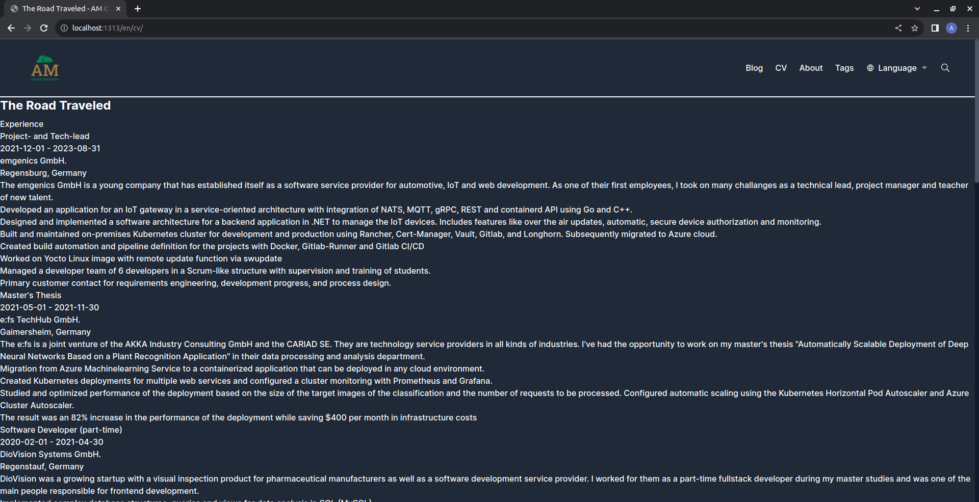
Open the inspection tools of your browser and you’ll see, that the contents of your cv.md file, as well as the json-resume data in the appropriate language, have been used to create new html elements containing all the information we’ve given. The resume looks pretty rudimentary at the moment, but before we give it some extra style, let’s take a look on how HUGO discovers the template file to use for a *.md file.
HUGO defines a base path for each *.md path, by taking the location of the file. For example, for our English CV, it will by default look for a layout thats located at layouts/en/baseof.html. That is, as I said before, if we don’t specify the layout. Now why does it use layouts/_default/baseof.html? This is due to the fact, that in case no folder in the layouts directory matches the first part of the path (in this case /en) HUGO chooses the _default directory to continue searching. As soon as we define a layout in the metadata section, HUGO combines the location of the *.md and the layout path. In our case this will result in layouts/<languageCode>/cv/cv.html and of course, due to the _default match it will take up the file layouts/_default/cv/cv.html. Ok, that’s it for the theory, let’s continue styling our CV 🎉
Layout and style for the CV page
First we will integrate the json-resume.css file, by customizing the head.html partial. As you may remember from the last post, partials are located in our theme repository at themes/blist. But this time, we do not want to change the theme, this is an application specific change, we’ll add in our own project. Furtunately, HUGO makes it very easy to overwrite theme files. Just create a file with same name and location in your project. So copy the existing themes/blist/layouts/partials/head.html to layouts/partials/head.html. And add following line:
<link rel="stylesheet" href="/json-resume.css" />
As you’ll see, this brings some styling to your resume page, but it still looks very messy. We’ll have to get our hands dirty and change the templates and styles ourselves. For reference, let’s look at the gruvbox theme again.
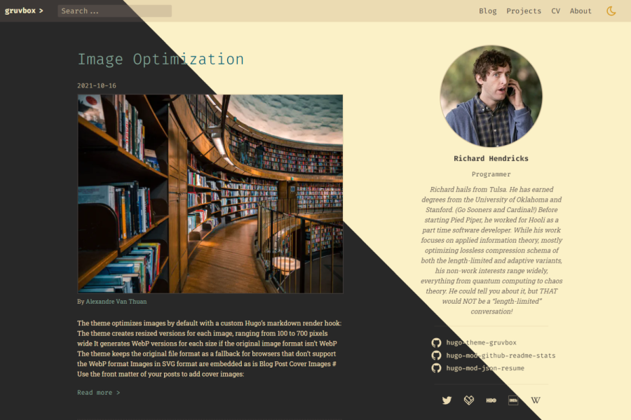
We’ll try and replicate the sticky sidebar, which keeps our basic information like contact information in a quick overview. It will always stick to the side of the screen, so it’ll be visible to our users no matter how far they scroll. To achieve such a layout, we need to edit cv.html. We’ll use a grid layout supported by the tailwind.css classes from our theme. Replace the <main> tag in your cv.html with
    <main class="grid lg:grid-cols-12 gap-5">
        <article class="lg:col-span-8">
            <h1 class="text-2xl font-bold mb-2"> {{ .Title }}</h1>
            {{ .Content }}
        </article>
        <aside class="dark:bg-gray-900 dark:prose-dark lg:col-span-4 m-0">
            <div style="top: 114px;" class="overflow-y-auto sticky z-1 basics-fixed-height">
              {{ partial "json-resume/basics.html" . }}
            </div>
        </aside>
    </main>
With this template we create a grid, on large screens it will have 12 columns. We use the Tailwind function for conditional design, any class prefixed with sm: will only be applied if the screen size exceeds the defined breakpoint of small screens. Tailwind defines such breakpoints for responsive design, any Tailwind class may be prefixed with one of these predefined breakpoints:
- sm (Screen size >= 640px)
- md (Screen size >= 768px)
- lg (Screen size >= 1024px)
- xl (Screen size >= 1280px)
- 2xl (Screen size >= 1536px)
In case a class is prefixed with one of these responsive class identifiers, the class will only be applied, if the viewport meets the size conditions. On large screens, the article will take up 8/12 columns and the sidebar will take up 4/12 columns. On small screens, the sidebar will appear below our resume content. We’re using a partial from the hugo-json-resume plugin, which constructs a basic information layout for us. We manually set the top property of the sidebar container to 114px, this ensures that the header stays at the top of the sidebar. The exact value depends on your logo, as the header adjusts its size to fit its content. So you may need to calculate your own value for the top property. Additionally we use the tailwind sticky class to fix the position of the sidebar, the overflow-y-auto class to make sure we can scroll the sidebar independently and the z-1 class, to make sure it stays above all other elements.
At this point, I’ve decided to make adjustments to the theme’s header bar. As you scroll through the resume, the header disappears. For usability reasons, I want my visitors, to always have the option to navigate to any page, so I want a sticky header. Since I’v created my own fork of the blist-theme, I’ll not overwrite the header.html, I’ll change it directly in the submodule. Open the header.html and replace the <header> element with:
<header class="highlight-border-bottom sticky top-0 z-10 dark:bg-gray-800 flex justify-between md:justify-between gap-4 flex-wrap p-4 px-6 md:px-12 relative">
Here we’ve replaced the mx-auto that was used to center the header content with a margin. In our new header, the logo and menu items are at the left and right ends of the header, so the header element spans the entire viewport. Overwise, we’d have a sticky header in the middle, and scroll text flowing to the sides of it. We’ve used the sticky class once again, to fix the position. We want the header to always start at the top so we set its top position to 0. The last thing to mention is that I’ve decided to use borders, to make a clearer separation between the header, footer and main area. Therefore I’ve created two new classes in the themes themes/blist/assets/css/styles.css file:
:root {
    --border-highlight-color: rgba(158, 124, 71);
    --border-base-color: rgba(158, 124, 71, 0.5);
    --border-base-width: 2px;
}

.highlight-border-top {
border-color: var(--border-highlight-color);
border-top-width: var(--border-base-width);
}

.highlight-border-bottom {
border-color: var(--border-highlight-color);
border-bottom-width: var(--border-base-width);
}
In addition to the border in the header, add a highlight-bordor-bottom class to your main container in cv.html. There is one last thing to adjust in our theme. If you’ve already filled in your resume data, you’ll notice that the scrollbar to the side is the browser’s default scrollbar. It breaks our theme and looks very bad, so let’s style it by editing styles.css again.
  ::-webkit-scrollbar {
    width: 8px;
  }

  /* Thumb */
  ::-webkit-scrollbar-thumb {
    background: #4b5563; /* Color of the scrollbar thumb */
    border-radius: 5px; /* Rounded corners for the thumb */
  }

  /* Track background */
  ::-webkit-scrollbar-track {
    background: #111827; /* Color of the track */
  }

  /* Corner */
  ::-webkit-scrollbar-corner {
    background: #111827; /* Color of the scrollbar corners */
  }
Now let’s get back to the sidebar, we still need to edit the style and spacing of its content. If you look at the layout in your browser, you’ll see that all the elements have different classes that we can use in our css to customize everything we need. To do this, use the copy of `json-resume.css’, that we’ve added to our repository. The little details of this CSS are not very interesting, so either try to style it yourself, or copy the json-resume.css from my repository. This will also add the css definitons for the resume content inside the <article> tag. Add the following classes to your article tag to apply them:
<article class="mx-auto lg:col-span-8 prose lg:prose-xl p-4 dark:prose-dark dark-bg-cv">
I’m not going to explain everything, but we should take a look on the specifics for the responsive design:
/* screen size specifics */
@media (max-width: 639px) /* < tailwind sm */ {
    .jr__date-range,
    .jr-work__location,
    .jr-work__position,
    .jr__date-range {
        flex-basis: 100%;
    }
}

@media (min-width: 640px) /* tailwind sm */ {
    .jr__date-range,
    .jr-work__location {
        flex-grow: 1;
        text-align: right;
        flex-basis: 40%;
    }
    .jr-work__name {
        flex-basis: 60%;
    }
}

@media (min-width: 1024px) /* tailwind lg */ {
    .basics-fixed-height {
        height: calc(100vh - 114px);
    }
}
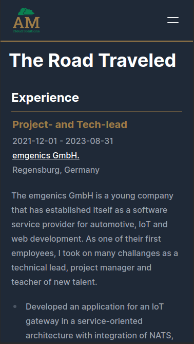
We want the resume to look good at all sizes, so we’ll define two different styles, one for large screens and one for small screens. On large screens, there’s enough space for all the text, so we can put the job-position in one line with the date, and the company in one line with the location. We use the flex-wrap property for line breaks, which means, the flexbox will automatically place the next item in the next line, if the space of the line is occupied. So for a screen width above 640px, our breakpoint for small screens, we set the flex-basis of the .jr-work__name to 60 % and for the jr__date-range to 40 %. This forces the company name into the next line. The flex-grow 1 on jr__date-range and jr-work__location, enables these elements to take up all the remaining space in their line. With this property we enable the text-alignment to the right side. For small screens we set the flex-basis of all the classes to 100 %, forcing a line break for each element. This way we get these two designs for small and for large screens:
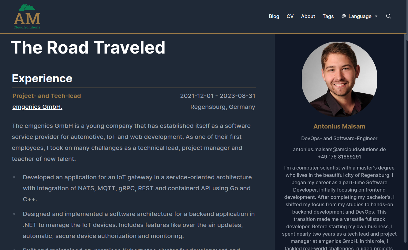
With this our resume page is finally finished.
Conclusion
In this article we’ve seen how to integrate json-resume and create a custom resume page for our website. We’ve learned about HUGO’s layout overwrite feature and how to define different layouts for different parts of your application. We’ve added an external package and used HUGO’s shortcodes to create a responsive design that fits perfectly into our website’s design. In the next article in this series, I will show you how to create a build process that is independent of your development environment using Docker and how to serve your homepage using Apache, stay tuned.
HUGO Website Series
